Elysian Haven
Case File / 003 — Brand Identity
Project overview
The facts first.
Brand: Elysian Haven, a luxury resort concept.
Context: a hospitality destination still in development.
The objective: build a distinctive premium presence ahead of opening.
The work: EH monogram and logo, core identity, colour and typography direction, branded touchpoint concepts, social visuals and Story motion.
The case
Services
Brand Identity
Visual Direction
Social Content
The doors weren’t open. The identity had to arrive first.
Before a guest could walk through the doors, Elysian Haven needed to communicate what kind of place it intended to become.
01 / The Case
A first impression, before the first arrival
A first impression, before the first arrival.
How do you introduce a destination when the destination itself is still taking shape?
For Elysian Haven, the challenge was to make the promise of a luxury stay feel recognisable before the resort opened. With the property still in development, an identity had to stand in for the experience: distinctive enough to be remembered, calm enough to feel considered and flexible enough to extend beyond a logo.
The question
How can a brand suggest the feeling of a place that people haven’t visited yet?
02 / The Clue
Luxury doesn’t need to raise its voice
Luxury doesn’t need to raise its voice.
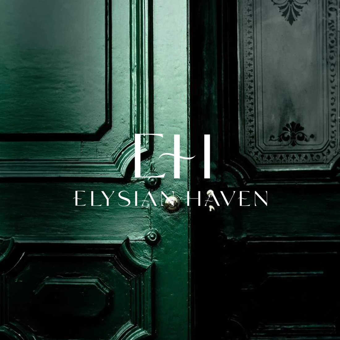
The direction was found in a few consistent details: deep forest green, soft ivory, expressive serif lettering and a restrained EH monogram. Together they suggest privacy, warmth and understated confidence rather than obvious extravagance.
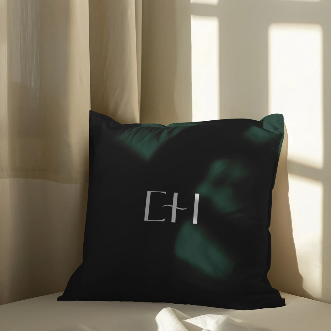
The logo needed to work at two extremes — from a single intimate mark on a cushion to an unmistakable signature across hotel stationery. The visual language had to feel equally at home in a guest room, by the water or on a small screen.
The clue
The strongest luxury cues are often the quietest.
03 / The Move
Give the promise a signature
Give the promise a signature.
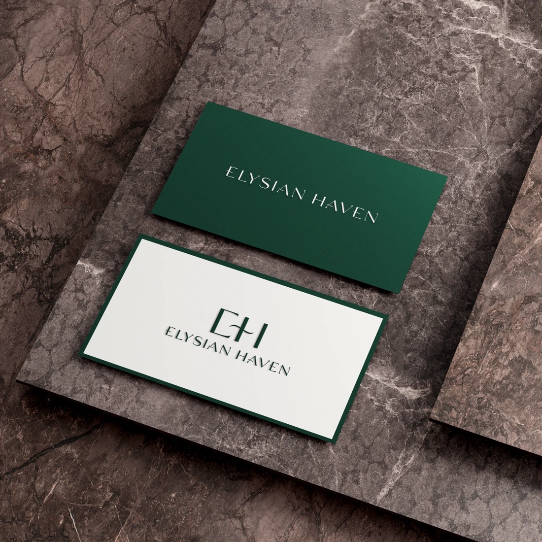
The identity centres on the EH monogram and Elysian Haven logotype. Two original colourways — ivory on forest green and forest green on ivory — give the mark a consistent foundation. A softly metallic gold treatment appears in selected presentation mockups as an additional premium detail, not an always-on effect.
Around the identity, a supporting system of spacious layouts, photography and refined typography creates room for the materials and textures to speak. Nothing needs to shout to be noticed.
Brand identity / one page
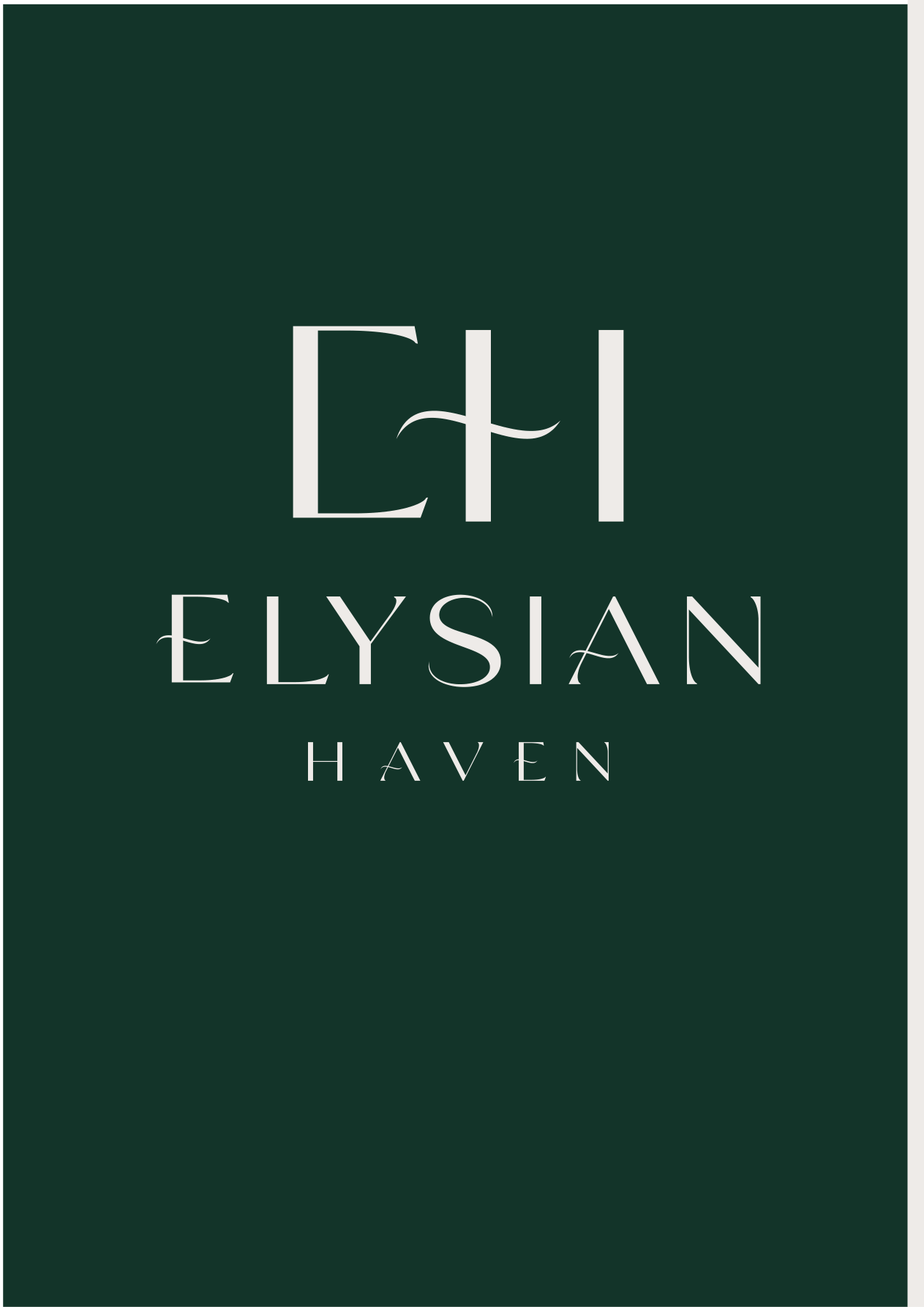
- Forest Green#143429Core
- Warm Ivory#EFECE8Core
- Soft Gold#C8A75DSupporting · suggested
- Natural Stone#B9AEA1Supporting · suggested
Typography direction
A high-contrast editorial serif paired with an understated modern sans. Suggested web pair: EB Garamond (display) and Manrope (supporting). The typeface of the supplied outlined logo cannot be verified, so it is not named.
04 / The Applications
Follow the mark beyond the page
Follow the mark beyond the page.
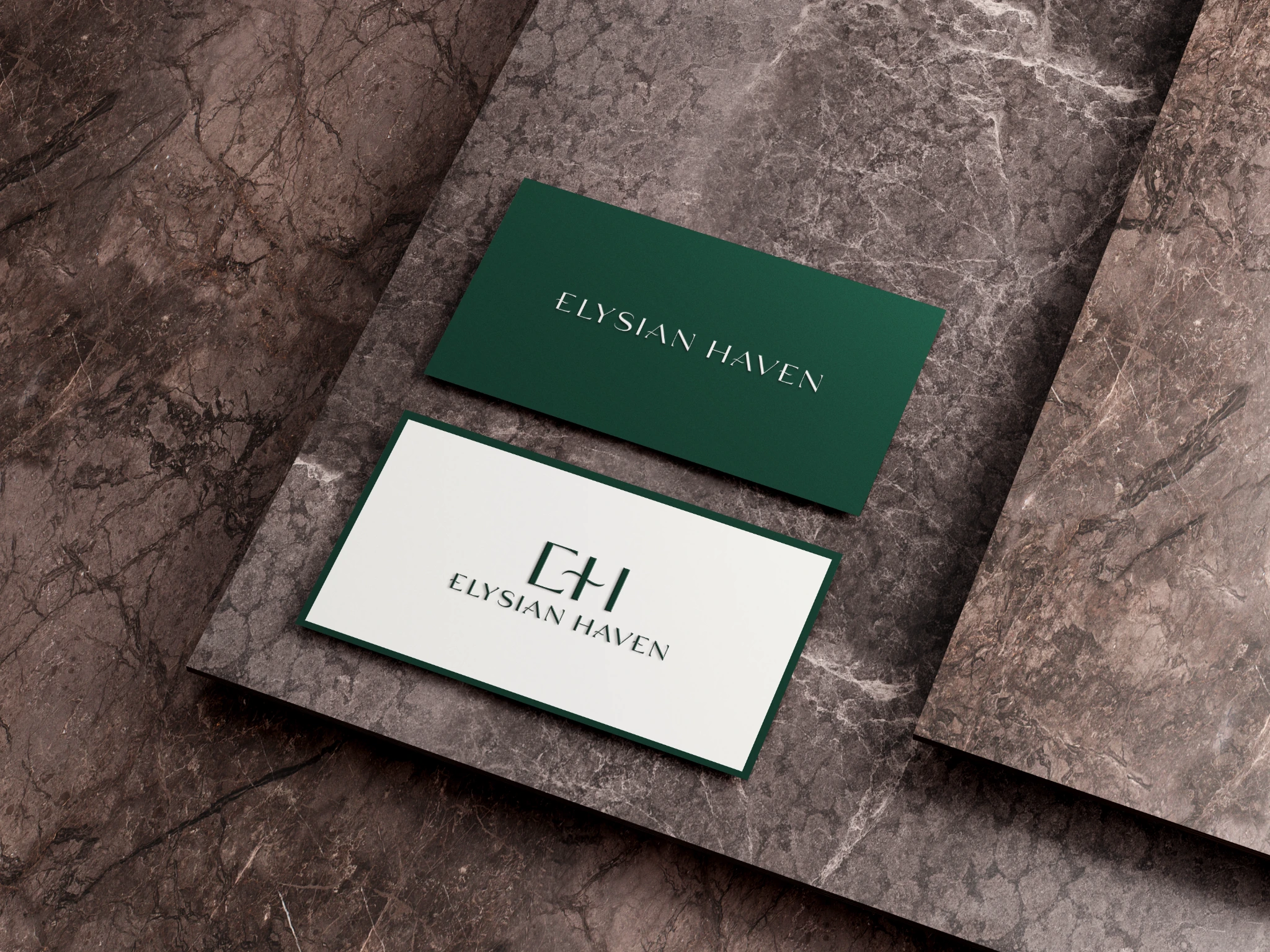
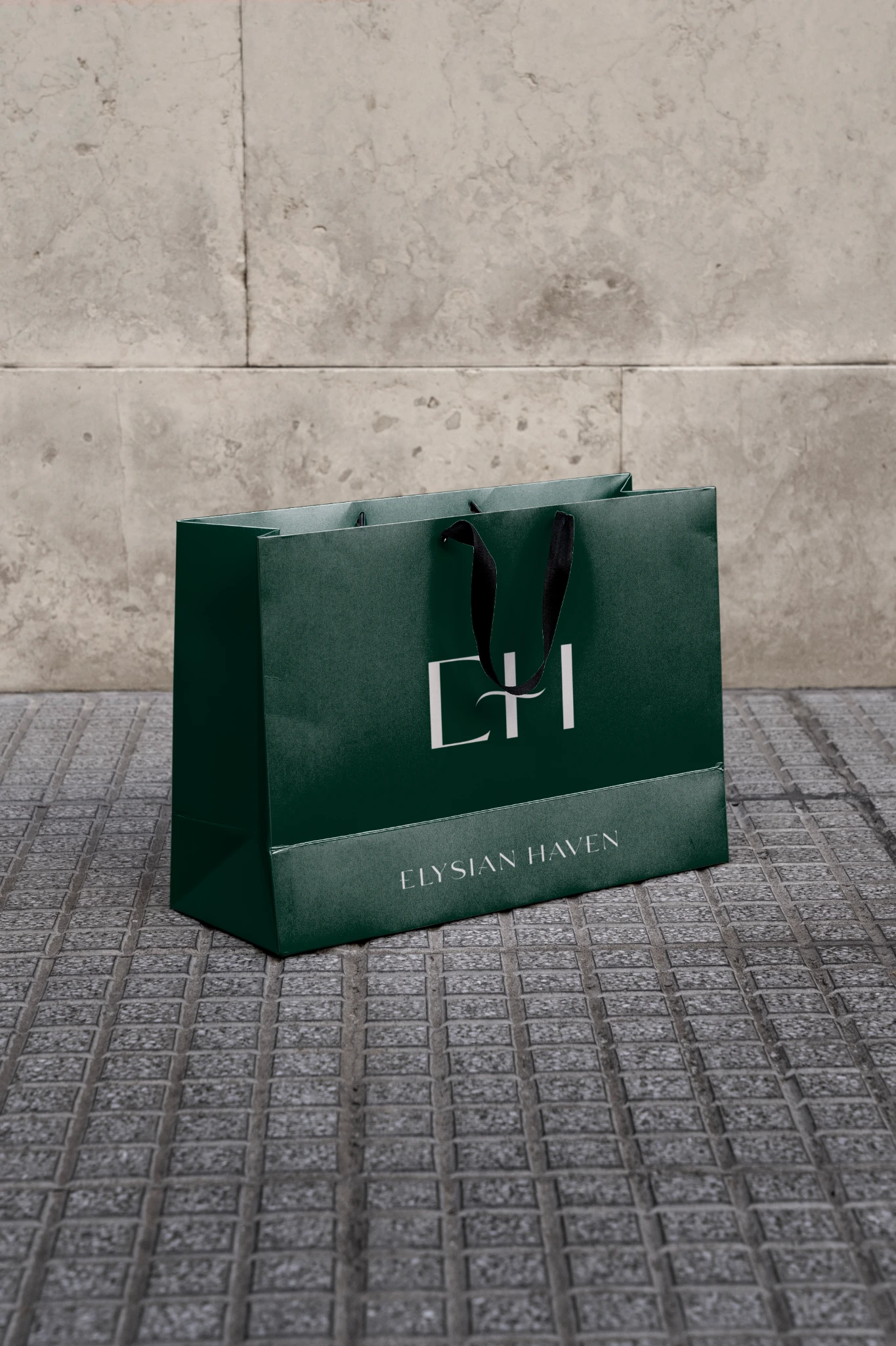
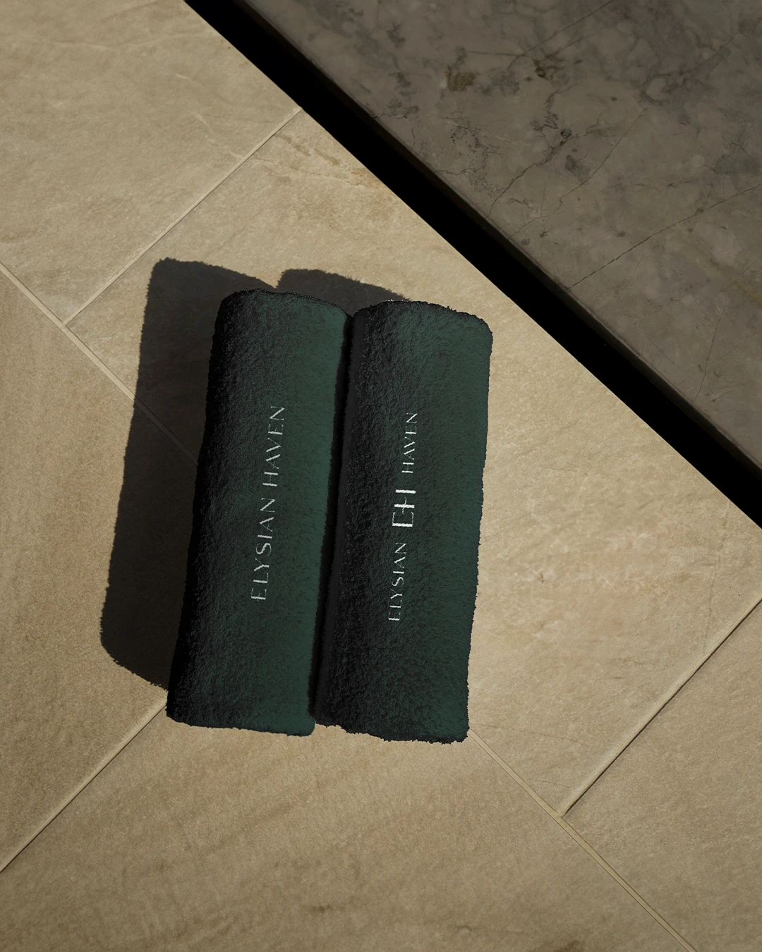
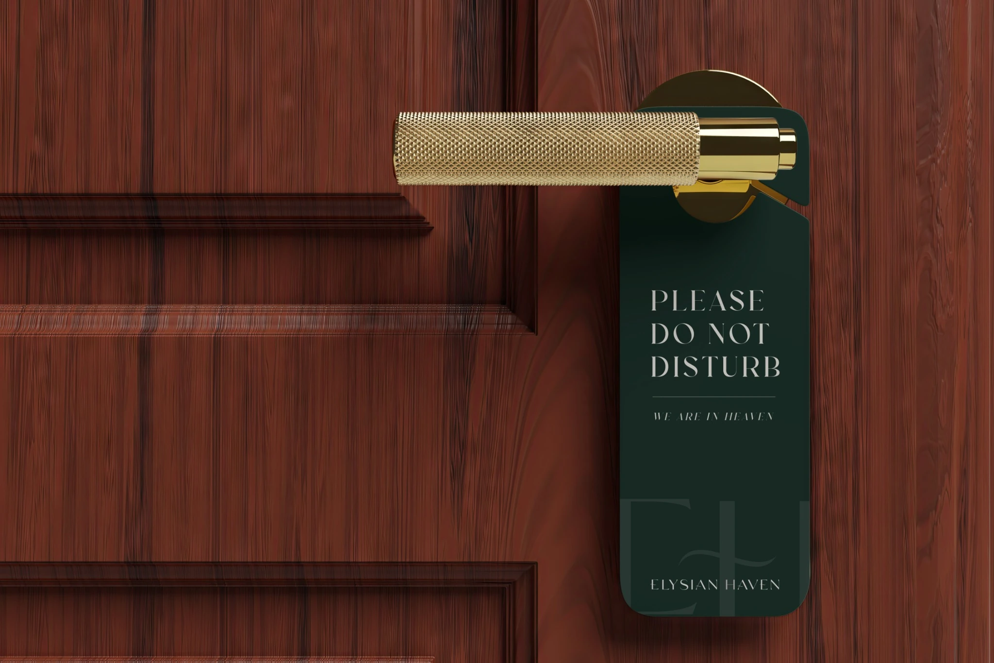
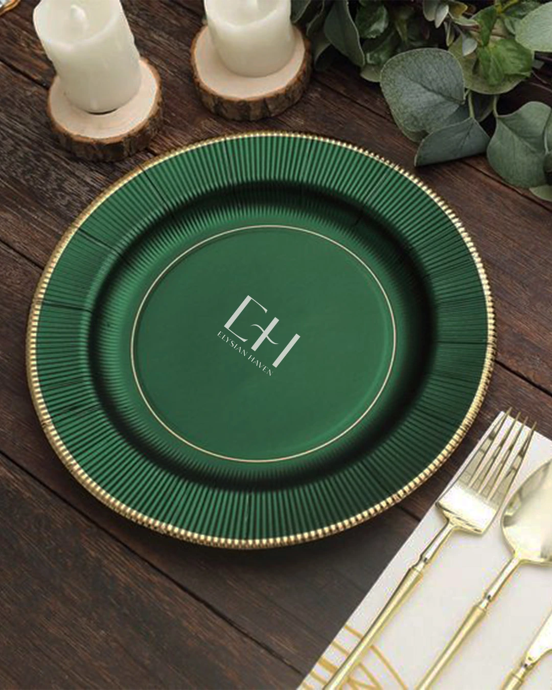
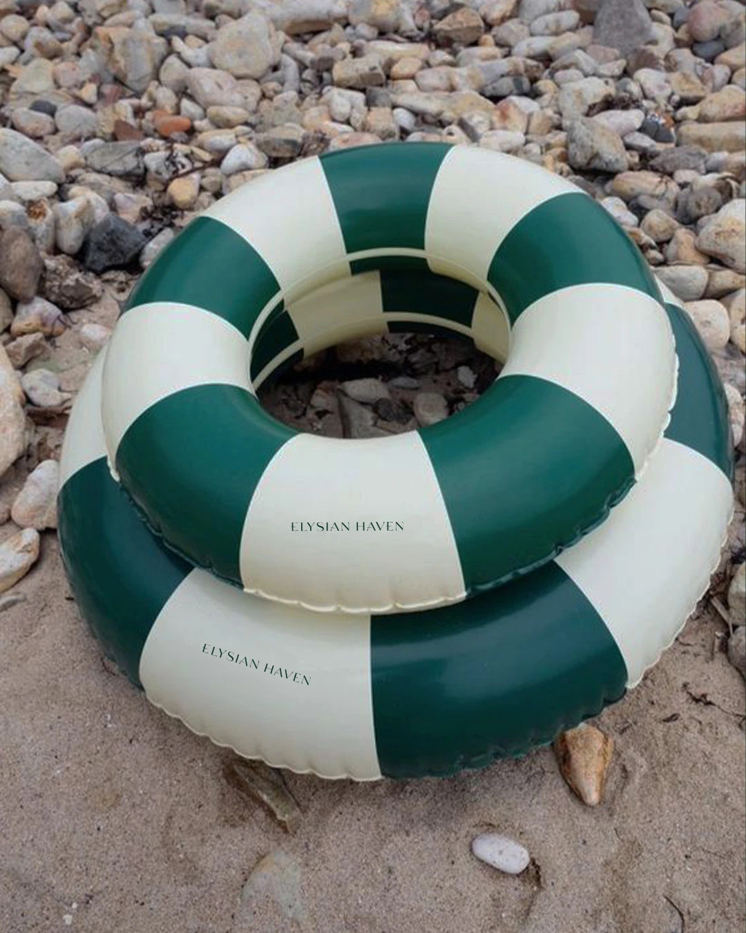
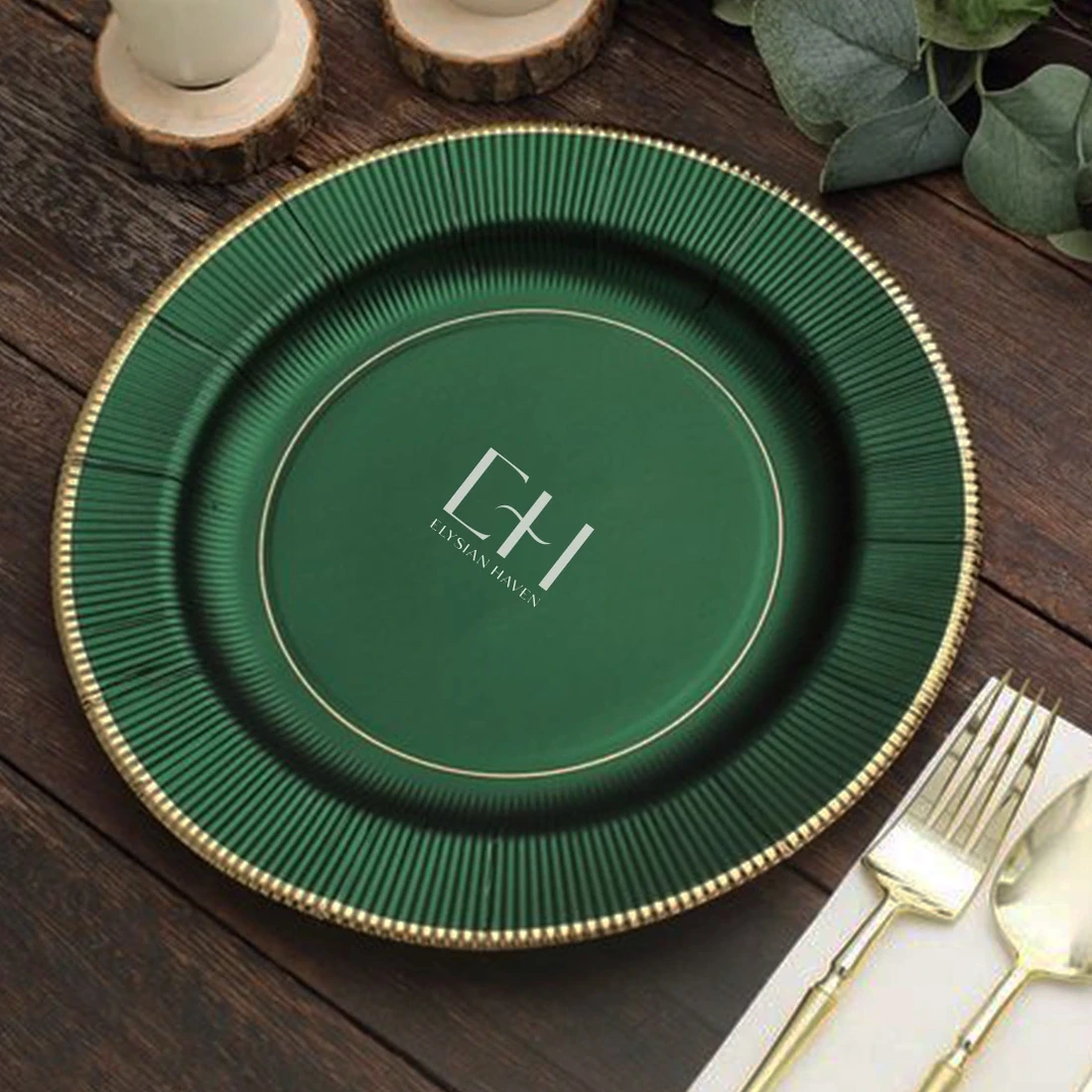
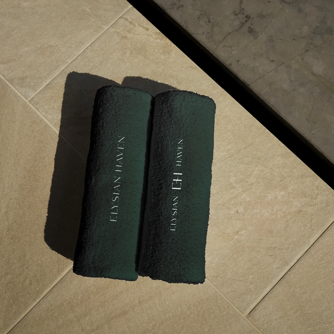
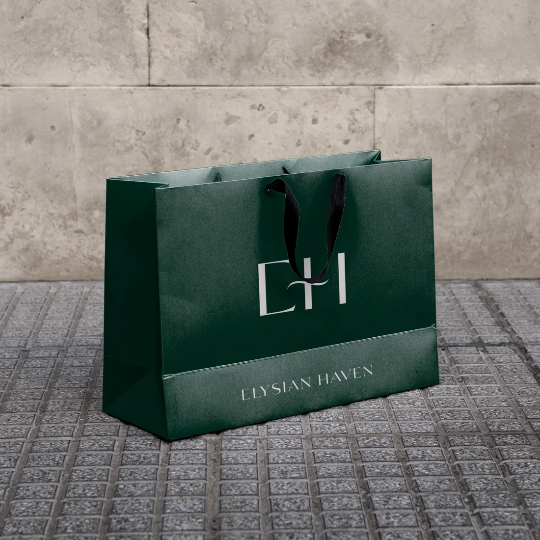
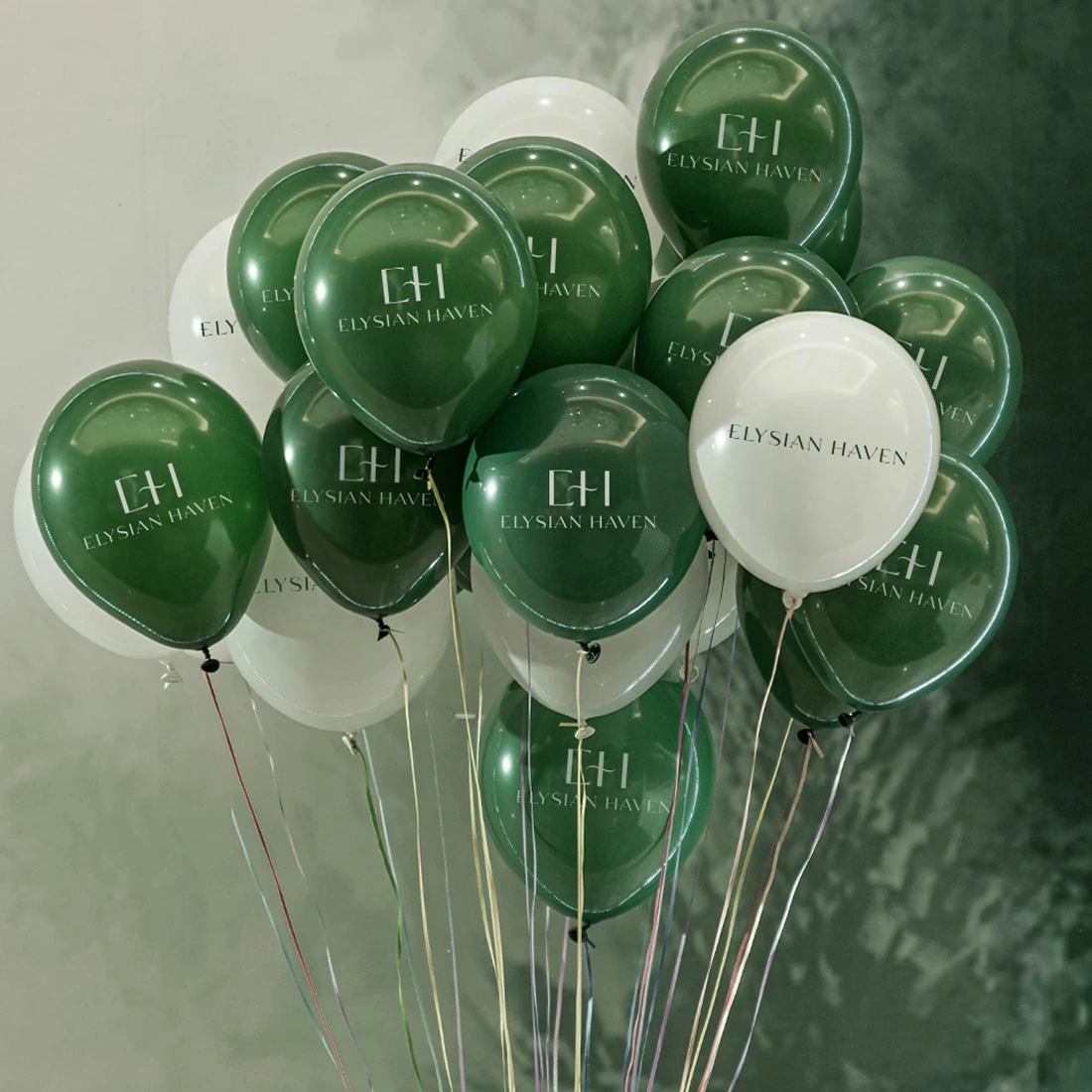
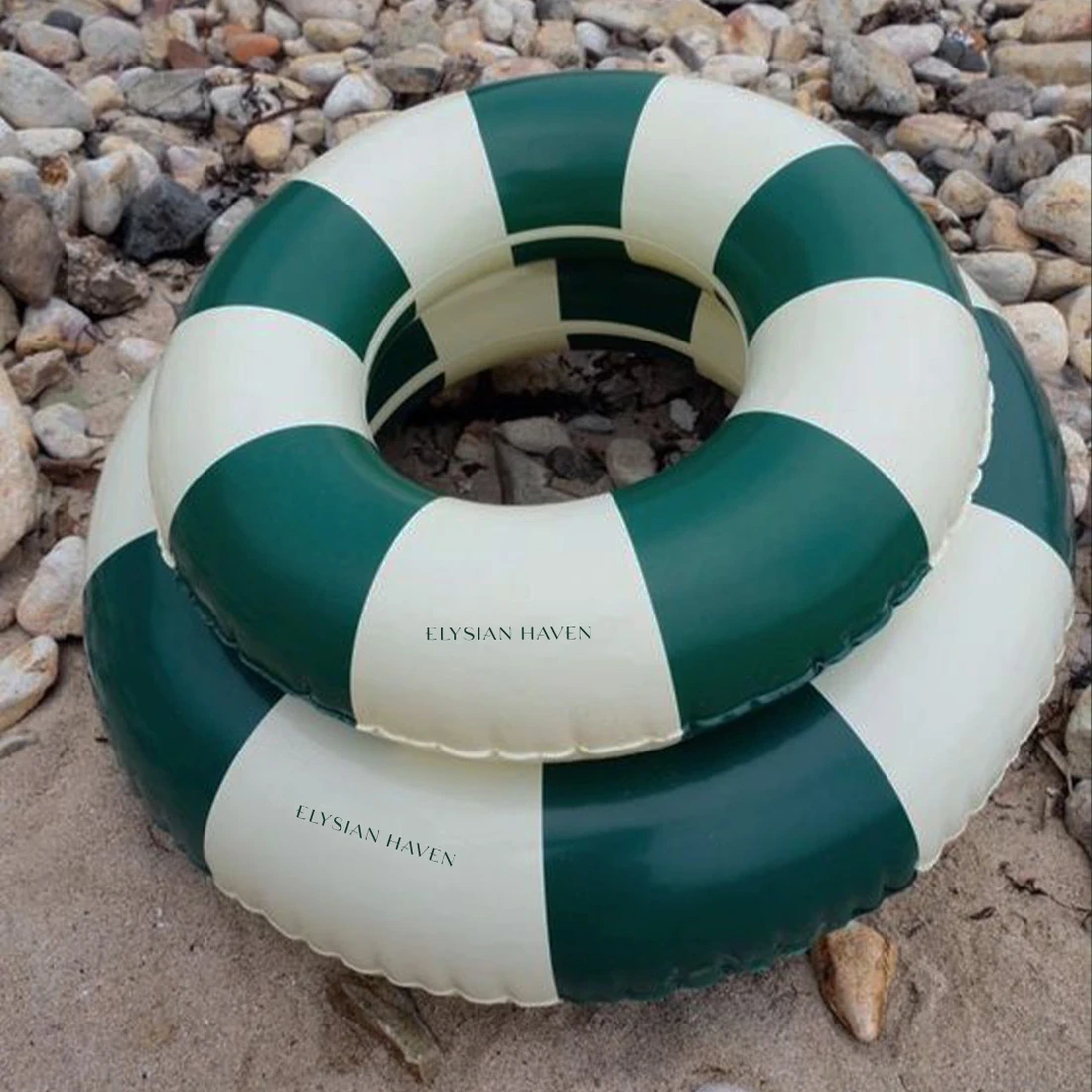
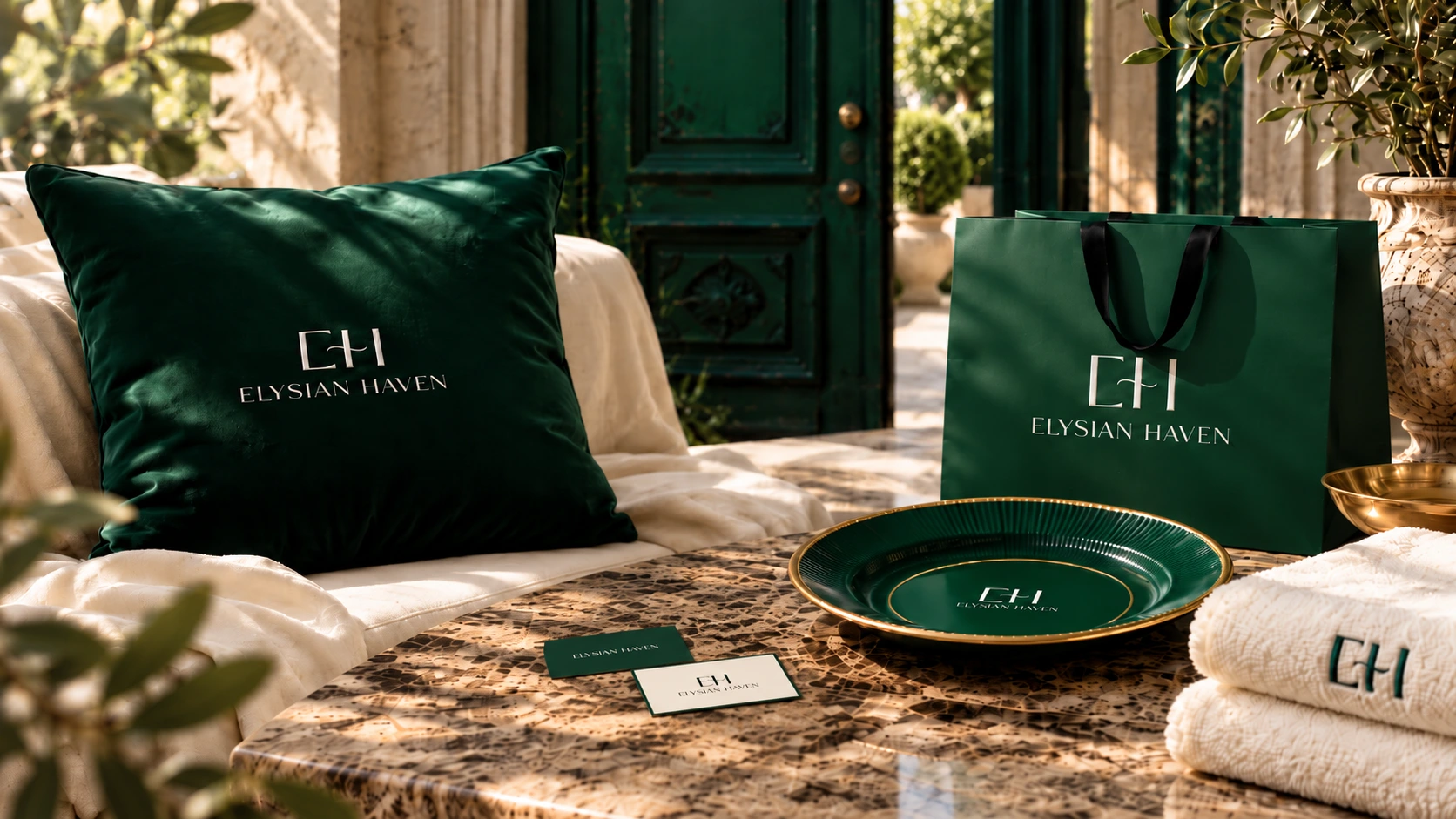
An identity for a resort cannot live only on a screen. It has to feel believable in the small details that shape a stay. The visual concepts explore the brand across business cards, bags, towels, a dining plate and a door hanger, with poolside accessories extending the language into more playful hospitality moments.
Different objects. Different materials. The same recognisable signature. These are designed applications and mockups — not photographs proving that the resort is already operating.
05 / The Social World
A sense of place, before the place
A sense of place, before the place.
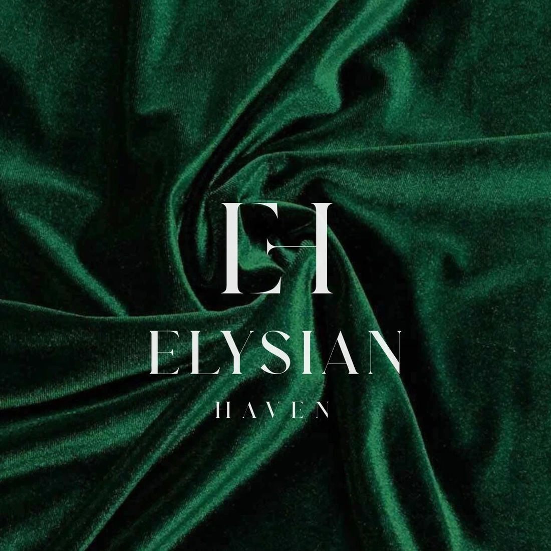
The social direction carries the same visual cues online: architectural details, tactile fabrics, green-and-ivory contrasts and carefully selected brand moments. Instead of making premature promises about a finished property, the content creates anticipation through atmosphere and consistency.
A curated grid of existing concept visuals shows how the identity could translate into an Instagram presence. A short vertical motion piece brings the monogram into a more cinematic setting — a glimpse of the mood rather than an announcement of an opening date.
Content direction
Atmosphere · Signature Details · Anticipation
06 / The Finding
The brand arrived before the guests
The brand arrived before the guests.
The outcome is a coherent identity proposal, from the original EH logo to its application across hospitality materials and social content. The project demonstrates how branding can give a future destination a recognisable personality before its physical experience is ready.
A place takes time to build. Its identity can start telling the story now.
Portfolio clarification
Elysian Haven is shown here as a pre-opening hospitality branding and visual concept using supplied original identity artwork, mockups and Story motion. The portfolio does not claim the resort has opened, that mockups were manufactured, or that social content was published.
Project focus
Identity, Applications & Social Direction
An identity proposal for a luxury resort still in development: the EH monogram and logotype, a colour and typography direction, branded touchpoint concepts, curated social visuals and a short vertical Story. Pre-opening concept; no opening, publication or results are claimed.