Vitality Bloom
Case File / 004 — Brand & Campaign Design
Project overview
The facts first.
The brand
Vitality Bloom
An emerging beauty and wellness brand bringing thoughtful design to everyday self-care.
The project
Identity meets campaign.
A freelance creative project connecting brand identity, product packaging and digital campaign design.
The product
Radiance Collagen Powder
The featured beauty supplement, introduced with an offer of 20% off and free shipping.
The objective
From first impression to action.
Create a seamless visual journey from campaign content to a dedicated product landing page.
The audience
Beauty meets wellness.
Adults aged 25–40 interested in skincare, self-care and a more considered approach to everyday wellness.
The creative scope
One idea. Multiple touchpoints.
Logo and visual identity · Packaging design · Audience research · UX planning · Landing page design · Social content · Animated banner · Reel.
Project
Freelance project
Services
Packaging Design
Landing Page Design
Campaign Creative
The product was only the beginning.
A beautiful first impression. But where does it lead? A visual identity, a hero product and a digital experience designed to work as one connected story.
01 / The Case
Looking good wasn’t the whole brief
Looking good wasn’t the whole brief.
The obvious direction for a beauty product? Make it look beautiful. But a polished image alone doesn’t explain why someone should stop, trust the message or take the next step.
Vitality Bloom needed more than an attractive jar. The assignment was to build a recognisable identity around a beauty-and-wellness promise, then translate that identity into a landing experience and campaign content for Radiance Collagen Powder.
The original offer was direct — 20% off plus free shipping. The creative challenge was to give that offer context without losing the brand’s calm, natural character.
The question
How do you connect a desirable first impression with a clear path to action?
02 / The Clues
Two reasons people say yes
Two reasons people say yes.
The source project included a competitor-reference exercise, two customer personas and a user journey map. These are research and planning tools, not proof of market-wide consumer behaviour.
One audience mindset is drawn to aspirational wellness, an appealing visual identity and simple daily rituals. Another is more selective, looking for transparent information, understandable ingredients and credible explanations before considering a purchase.
That contrast shaped the direction: build desire, but make the information easy to find. Beauty may earn the first glance. Clarity has to earn the next one.
The clue
Attention and reassurance are different jobs. Good campaign design makes room for both.
03 / The Identity
A brand needs a signature
A brand needs a signature.
Before the product could become the campaign’s centrepiece, Vitality Bloom needed a consistent visual language.
The identity exploration develops a botanical-inspired symbol from V and B letterform experimentation, paired with the Vitality Bloom wordmark. Primary logo versions and a secondary circular lockup support different applications without changing the character of the brand.
A restrained, nature-led palette combines deep brown, earth olive, warm sand, sage olive and soft cream. The type pairing contrasts Butler, the original primary display typeface, with Coco Gothic, the original secondary typeface.
The result is intentionally gentle but not generic: warmth for the beauty side, structure for the information side.
Brand identity / source specification
- Deep Brown#352A1B
- Earth Olive#504B33
- Warm Sand#B79C74
- Sage Olive#9C9873
- Soft Cream#E8DCC4
Typography · source specification
Butler (primary, editorial display) and Coco Gothic (secondary, clear modern support). Brand values in the original brief: natural ingredients, radiant skin, inner wellness, sustainable practices.
04 / The Product
Give the promise a form
Give the promise a form.
The hero product was Radiance Collagen Powder, selected for a focused promotional push rather than an unfocused presentation of the brand’s full range.
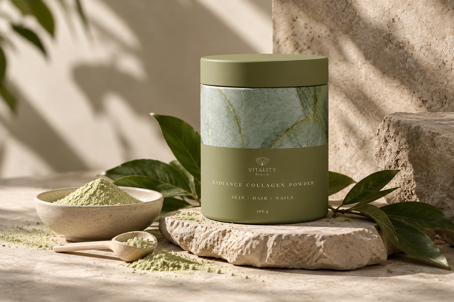
The packaging direction carries the same olive-and-cream identity as the wider brand, with a botanical surface treatment and a clean hierarchy that brings the product name forward. In the campaign imagery, the package becomes the visual anchor: recognisable enough to move between a product still-life, a landing page and social content.
The original brief described a beauty-and-wellness audience looking for radiant skin and everyday self-care. Marketing copy in the source explores skin hydration, elasticity and a natural glow. Those are promotional messages from the concept, not independently verified clinical claims.
The move
Make one product immediately recognisable — then use the surrounding content to explain the offer.
05 / The Journey
A click is only the beginning
A click is only the beginning.
The research moved beyond aesthetics to the sequence a potential customer might follow: discover the product, understand the benefit, evaluate the offer, then decide whether to continue.
That is why the campaign did not end at a social post. The landing page needed a clear visual hierarchy, a recognisable product, a focused promotional message and a next action that was easy to find.
For a more cautious buyer, clarity about ingredients and product details matters as much as the visual appeal. The concept therefore balances editorial storytelling with concise benefit-led content, rather than making the page feel like a catalogue of competing offers.
| Phase | Aware | Join (Purchase from LP) | Use (Initial Product Use) | Develop (Loyalty & Advocacy) | Leave (Potential Churn) |
|---|---|---|---|---|---|
| Substage title | Sees Promotion / Discovers Brand | Evaluates Landing Page & Makes Purchase | First Experience with Product & Routine Integration | Sees Results, Engages Further, Recommends | Considers Alternatives / Stops Using |
| User Actions(Blank + Arrow) | ➡️ Browses Instagram feed/stories. Sees a visually appealing Vitality Bloom ad for “Radiance Collagen Powder” with 20% off. | ➡️ Clicks ad. Lands on Vitality Bloom LP. Scans hero section, offer, key benefits (“Glow from within”). Feels positive about the aesthetic. Clicks “Shop & Save Now.” (Proceeds to checkout) | ➡️ Receives product. Admires packaging. Reads instructions. Mixes powder into a drink. Tries it for the first time. Starts incorporating into daily routine. | ➡️ Uses consistently for a few weeks. Notices improved skin radiance. Feels good. Follows Vitality Bloom on IG. Likes/comments on posts. Tells a friend about it. Considers other products. | ➡️ Product runs out, forgets to reorder. Sees a compelling ad from a competitor. Price increases. Doesn’t feel the results are significant enough for the cost anymore. |
| Thoughts / Questions(Blank Box) | “Ooh, this looks nice! Collagen? And a discount?” “Is this a new brand? The vibe is good.” “What are the actual benefits?” | “The page looks trustworthy and clean.” “Natural ingredients, that’s good.” “20% off + free shipping is a good deal.” “Will this actually work for my skin?” “Is it easy to buy?” | “Hope this tastes okay and isn’t a hassle to mix.” “How long will it take to see results?” “Is this something I can stick with?” | “My skin definitely looks brighter!” “I actually enjoy taking this.” “What else does this brand offer?” “I should tell [friend’s name] about this.” | “Is this still the best option for me?” “Maybe I should try that other brand everyone is talking about.” “Did it really make that much of a difference?” |
| Pain Points(Red Box) | Ad might get lost in a busy feed. Initial skepticism about a new brand. Unclear if it’s just another fad. | Landing page slow to load. Information is hard to find or overwhelming. Trust signals are weak (no reviews visible initially). CTA isn’t clear or compelling enough. | Unpleasant taste or texture. Complicated preparation. Forgetting to take it daily. No immediate visible results leading to doubt. | Not seeing desired results quickly enough. Lack of ongoing engagement from the brand (new content, tips). Product is often out of stock. | Perceived lack of continued value for money. Better or cheaper alternatives appear. Lifestyle changes. Negative experience with customer service. |
| Emotional State(Neutral face line) | Neutral 😐 -> Curious 🙂 | Interested 🤔 -> Hopeful/Excited 😊 | Anticipatory 🙂 -> (Potentially) Neutral 😐 / Satisfied 😊 | Happy 😍 -> Confident/Loyal 🥰 | Indifferent 😑 -> Considering 🤔 / Disappointed 🙁 |
| Opportunities(Green Box) | Highly engaging ad visual. Clear, concise offer. Smooth transition to LP. Use of trusted influencer (if applicable). | Fast-loading, visually appealing LP. Clear benefit statements. Strong social proof (testimonials). Easy-to-find CTA. Simple purchase process. | Pleasant taste/texture. Clear usage instructions. Tips for incorporating into routine. Beautiful packaging enhances experience. | Visible results. Engaging social media content. Community features (e.g., user stories). Loyalty program. Email marketing with tips & new offers. | Re-engagement campaigns. Subscription offers. Requesting feedback to improve. Highlighting new benefits or formulations. |
06 / The Landing Page
Follow the visitor, not just the look
Follow the visitor, not just the look.
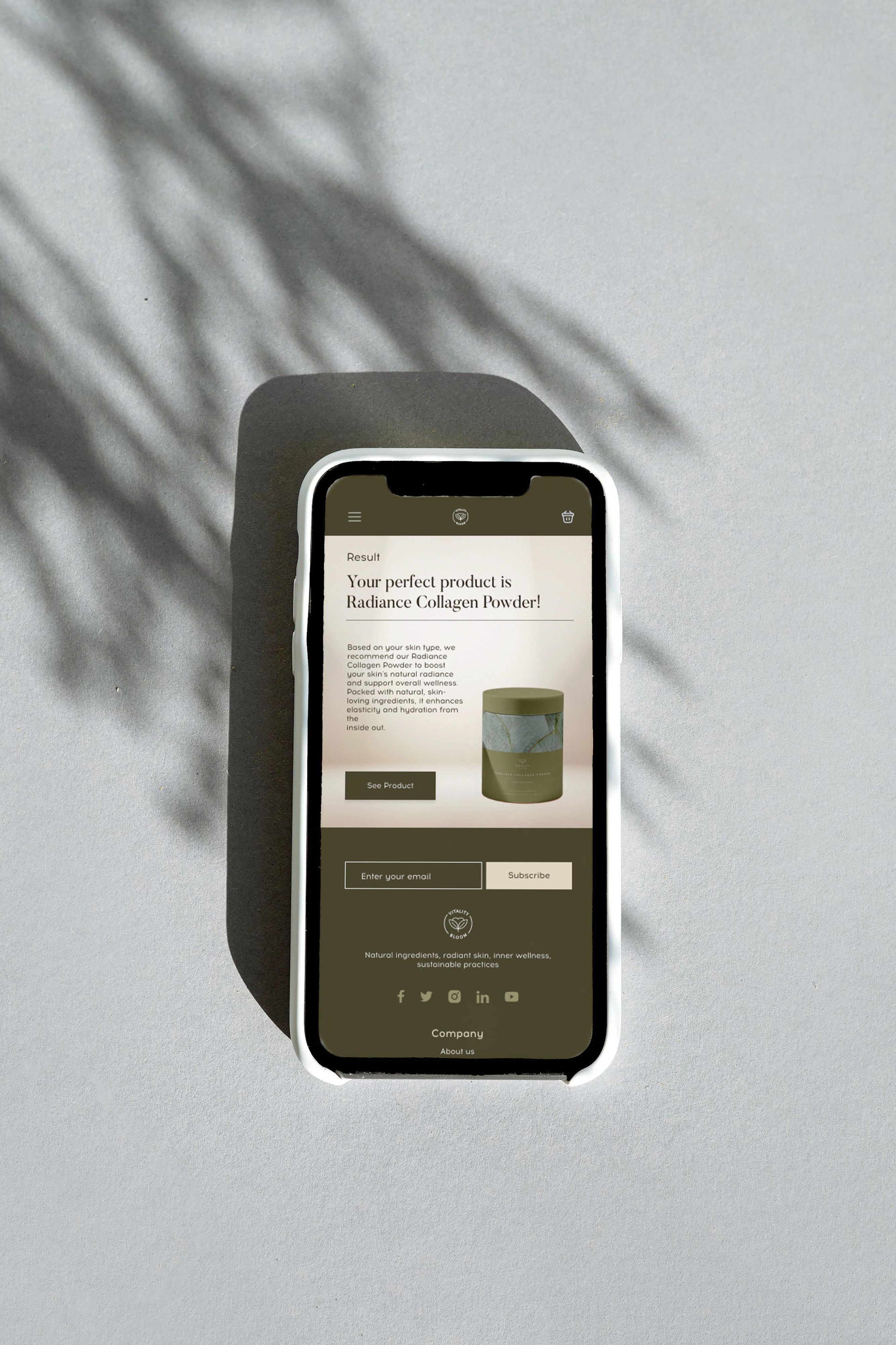
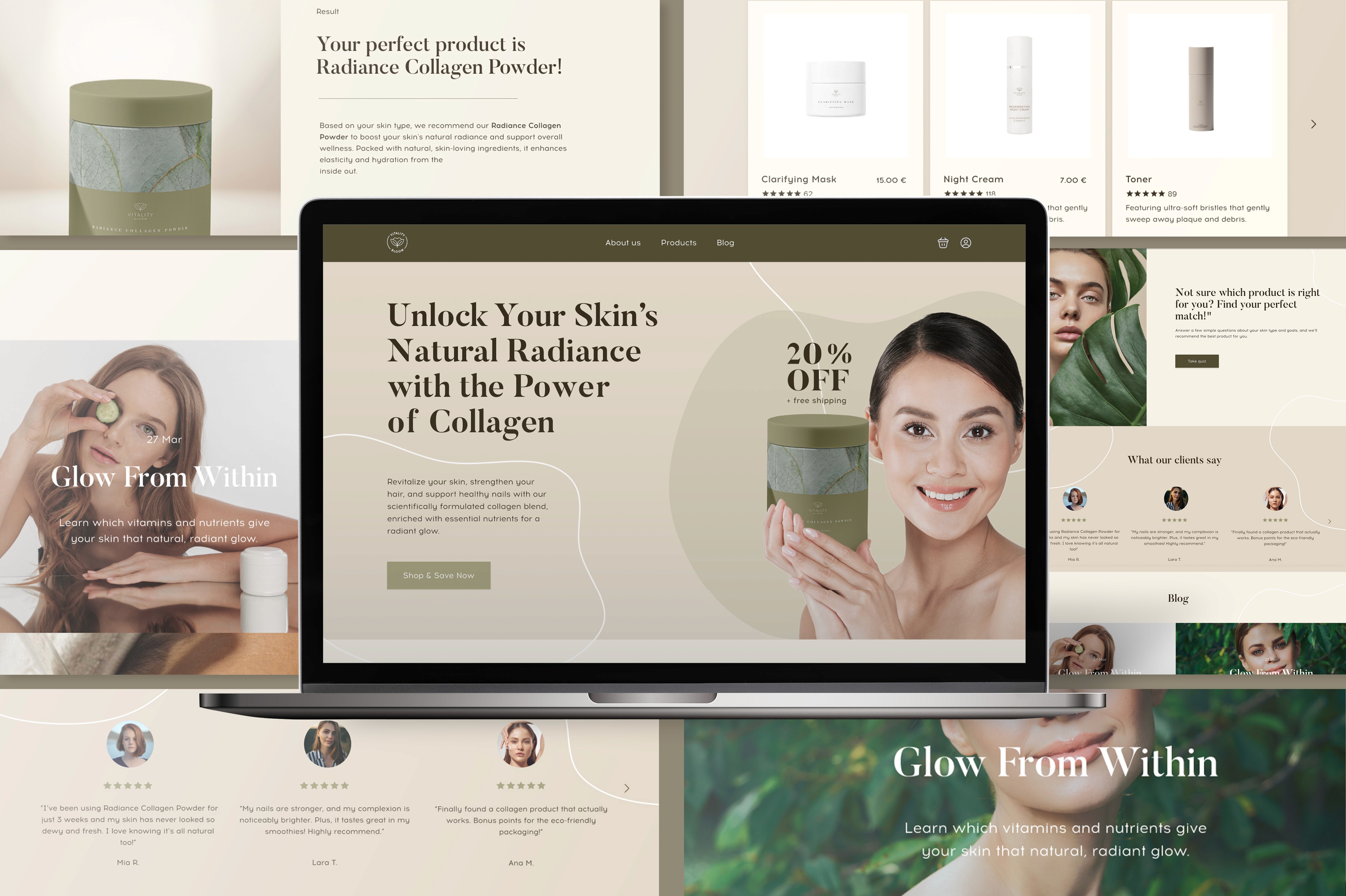
The landing concept brings the identity into a dedicated digital destination. Soft natural shapes, warm neutrals, botanical cues and the olive product pack tie the page back to the campaign creative.
At the top, visitors see the Radiance Collagen Powder proposition and 20% off plus free shipping offer. A clear call to action and a simple reading order move the experience from attraction toward consideration.
Desktop and mobile layouts were designed as part of the same visual system. The original Figma concept also includes proposed interactive paths such as Take Quiz and Shop More. These are prototype intentions, not a deployed e-commerce checkout.
The decision
Consistency should survive the screen size.
From desktop to mobile
Desktop and mobile design concepts · animated · not a live site
08 / The Finding
A product isn’t a campaign on its own
A product isn’t a campaign on its own.
The outcome is a complete freelance branding and digital campaign design package: logo development, visual identity, product packaging presentation, audience and journey thinking, a responsive landing concept, social formats and actual short-form motion.
No sales, orders, ad delivery, conversion rate or measured campaign performance are asserted. The evidence is the finished creative system and the way its parts work together.
The glow catches the eye. The connected experience gives it somewhere to go.
Portfolio clarification
Freelance design and campaign concept based on the supplied project brief and materials. The shown packaging and web layouts include design mockups and prototypes. Promotional product benefit claims are reproduced or summarised as creative copy, not medical verification. No launched campaign metrics or business outcomes are presented.
Project focus
Identity, Packaging & Campaign Design
A freelance brand identity, packaging presentation and coordinated campaign concept for Radiance Collagen Powder: logo and palette, research and journey map, desktop and mobile landing concepts, banner, social post, carousel and a nine-second Reel. No launch, sales or performance outcomes are claimed.